Brand Guidelines
Version 1, August 10, 2021
Click for a PDF version of the guidelines.
Introduction
A unified look says, “Here, everyone belongs.”
When our original logo was developed fifty years ago, it represented our growing district well. But with three high schools, each having its own unique mascot and color scheme, three middle schools, and multiple attendance areas, Forest Hills Public Schools has grown beyond the original logo’s capacity to deliver a coherent visual identity.
Thus, our new logo is designed to give Forest Hills Public Schools a single identity, one that works across the wide spectrum of applications in all of our schools and communication materials. All Forest Hills schools are united in our vision to help all learners achieve their individual potential. It is time our identity unites us as well.
Forest Hills is West Michigan’s premiere school district. Like any corporation, professional sports team, or university, we have crafted these brand guidelines with the sole intention of holding Forest Hills Public Schools to the standard our community deserves. Standardizing how we present Forest Hills to the public enhances our recognition and our association with exceptional education.
Visual consistency is how we represent the integrity with which Forest Hills seeks to help every student reach their individual potential. When you review and abide by these standards, you are not only helping to protect and nurture our new brand, you are telling the world that Forest Hills Public Schools is committed to cultivating possibility for every learner.
Forest Hills Public Schools aims to achieve quality and consistency in its visual messaging in order to build a sense of belonging, community pride, and brand loyalty. Please know, however, that these guidelines are a living document. It will be updated over time—in the short term as we finalize this first iteration of our standards, and in the long term, as we refine them.
Primary Logos
Our logo is the most important and recognizable element of our brand’s identity. It represents our organization to the community and acts as an identifying and unifying mark. The logo has been carefully crafted; no part of the logo is to be removed, changed, or recreated in any way.
Logo Reveal Video
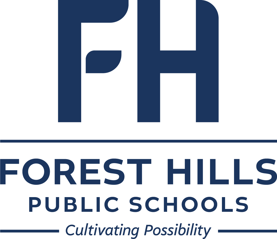
District Logo
The official color for the FHPS logo is FHPS blue (Pantone 534C or hex #1B365D). This is the preferred and approved use of the logo for the majority of district-wide communications and applications.
Click for full size logo (1152×981)
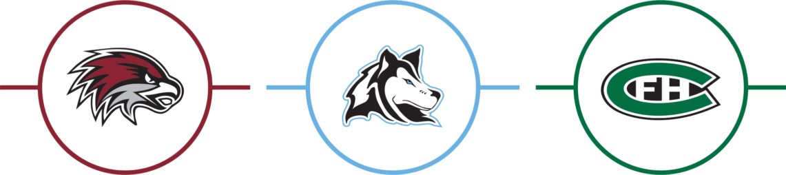
Attendance Area Logos
Each attendance area has its own version of the FHPS district logo. They are customized with the given attendance area’s color within the leaf. No other alterations are allowed. The following may be used on any communications coming from within one of the attendance areas.
Eastern Attendance Area Logo
Click for full size logo (1051×805)
Attendance Areas
Eastern High School
Eastern Middle School
Knapp Forest Elementary
Orchard View Elementary
Northern Attendance Area Logo
Click for full size logo (1051×805)
Attendance Areas
Northern High School
Northern Hills Middle
Northern Trails 5/6
Collins Elementary
Meadow Brook Elementary
Ada Vista Elementary
Central Attendance Area Logo
Click for full size logo (1051×806)
Attendance Areas
Central High School
Central Middle School
Central Woodlands 5/6
Ada Elementary
Thornapple Elementary
Pine Ridge Elementary
Secondary Logos
Variations of the logo have been created for use when needed. The primary stacked version in FHPS blue should always be the first choice.
Click on each of the logos below to download a full-resolution version of the logo.
Horizontal Logo
The horizontal version of the logo is to be used exclusively for applications that are long and narrow or require the logo to be less than .5” in height.

All White Logo
The logo may be used in all white when reversed out of colors included in the district’s color palette.

All Black Logo
The logo should be used in all black when printing in black and white.


Attendance Area Simplified Logos
In some instances a simplified version of the attendance area logos may be required. Use these approved versions when “Public Schools” is understood.
Tagline
Our tagline, “Cultivating Possibility,” should be included on district communications wherever possible. “Cultivating Possibility” is an essential component of our new brand. This short and concise statement clarifies the value of our brand, while our vision, mission, and guiding principles remain unchanged.
Logo Locked with Tagline
This is the only approved version for including the tagline locked with the logo.
Separate Element
The tagline should be a separate element when used with an attendance area logo, in copy-heavy applications, and in situations where the graphic is so small “Cultivating Possibility” becomes illegible.
Cultivating Possibility
Cultivating Possibility
Cultivating Possibility
Cultivating Possibility
Cultivating Possibility
Cultivating Possibility